A countdown timer's effectiveness depends as much on how it looks and where it sits as on the deadline it counts toward. The same timer can lift conversion in one layout and be completely ignored in another.
This matters more than most marketers realise. According to Designmodo's 2025 data, emails with images achieve a 4.84% click-through rate compared to just 1.6% for text-only messages. But it's not just about including an image — it's about placement, context, and how the visual element guides the subscriber toward the action you want them to take.
This collection gives you 12 proven email layouts for countdown timers, each with copy templates and guidance on when to use it. Every layout is designed for real inbox conditions — including how it degrades in Outlook desktop (static first frame) and what it looks like after the deadline passes.
For the strategic foundation, see our complete countdown timer guide and best practices.
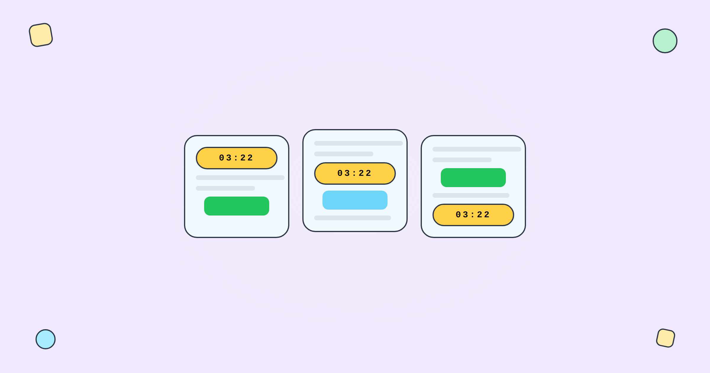
Structure: Full-width timer image as the primary visual, directly below the headline. CTA button immediately beneath.
Best for: Flash sales, time-sensitive announcements, anything where the deadline is the message. Used in Emails 2 and 5 of a flash sale sequence.
Copy template: "[Headline: 30% off everything] [TIMER — full width] [CTA: Shop now]" Keep it minimal. The timer does the heavy lifting.
Why it works: The timer is the first thing subscribers see after the headline. There's no scrolling, no browsing — just urgency and action. This layout consistently generates the highest click-through rates in flash sale sequences.
Outlook fallback: First frame should show the deadline text ("Ends Sunday 11:59 PM") since Outlook desktop won't animate the GIF.
Structure: Timer placed directly above the CTA button, below the main content. Smaller than hero size (typically 300–400px wide, centred).
Best for: Product-focused emails where the offer matters more than the countdown. The subscriber reads about the product first, then sees the timer as they approach the CTA.
Copy template: "[Product description and benefits] [Timer with label: 'Offer expires in:'] [CTA: Add to cart]"
Why it works: Following best practices, placing the timer near the CTA creates a visual urgency-action unit. The subscriber processes the value proposition, then the deadline reinforces the need to act now.
Structure: Timer embedded within the body copy, between the offer description and the CTA. Typically 200–300px wide, left-aligned or centred.
Best for: Longer emails where urgency is secondary to the message but still valuable. Newsletter-style content with a promotional section.
Copy template: "[Educational content or story] [Inline: 'By the way — this offer expires in: [TIMER]'] [CTA: Learn more]"
Why it works: The timer doesn't dominate the email but reminds the reader that the offer isn't permanent. Good for maintaining urgency without making the entire email feel like a sales push.
Structure: Two-column layout. Left column: offer details and CTA. Right column: countdown timer (stacked vertically — days, hours, minutes, seconds).
Best for: Emails with dense product information where you want persistent urgency without interrupting the content flow. Works well for product launches with detailed specs.
Copy template: "[Left: Product name, key features, price, CTA] [Right: Timer with label 'Launch price ends in:']"
Mobile note: Two-column layouts stack on mobile. Ensure the timer stacks above the CTA, not below, so the urgency is visible before the action button.
Structure: A thin, full-width banner bar at the top of the email containing a small timer and a brief urgency message. The rest of the email continues as normal content below.
Best for: Newsletters or content emails that happen to overlap with a sale period. The banner adds urgency without redesigning the entire email.
Copy template: "[Banner: '🔥 Summer sale ends in [TIMER] — Shop now →'] [Regular newsletter content below]"
Why it works: Subscribers who care about the sale click the banner. Subscribers who came for the content scroll past it. No one feels ambushed by urgency they didn't expect.
Structure: Timer paired with a social proof element: "2,400 orders in the last 12 hours." Both placed above the CTA.
Best for: Mid-sale emails in a flash sale sequence (typically Email 4). The combination of temporal scarcity (timer) and social validation (others are buying) is particularly powerful.
Copy template: "[Social proof stat] [Timer] [CTA: Join them — shop now]"
Structure: Individual product cards, each with their own small countdown timer below the price. Best suited for curated picks or category emails.
Best for: Emails featuring 3–6 products where each has the same shared deadline. The timer on each card reinforces that every product is time-limited.
Note: All timers use the same Tickvio URL — one timer, displayed multiple times. No need to create separate timers per product.
Structure: Text-only deadline mention with a very small timer image (100–150px wide) inline. Almost an afterthought visually, but still creates urgency.
Best for: B2B emails, professional contexts where a large animated GIF would feel out of place. SaaS upgrade prompts, financial services deadlines.
Structure: Timer referenced in the preview/pre-header text ("Sale ends in 6 hours") with the actual animated timer inside the email body. The pre-header creates urgency before the email is even opened.
Best for: Any campaign where the subject line mentions urgency. The pre-header amplifies the subject line's promise.
Structure: Product image and details (left), timer and CTA (right). The timer emphasises the cart reservation window, not a discount.
Best for: Cart abandonment flows. Cart abandonment emails achieve 39.07% open rates and 23.33% CTR according to Analyzify's 2024 data — a well-designed timer layout maximises conversion from these high-intent opens.
Copy template: "[Left: Product image, name, price] [Right: 'Your cart is reserved for: [TIMER]' + CTA: Complete purchase]"
Structure: Welcome message at top, discount code prominently displayed, timer showing the personal countdown window, CTA below. Clean, focused, no distractions.
Best for: Welcome series emails. Welcome emails achieve 83.6% average open rates according to GetResponse benchmarks — the timer converts this attention into action.
Copy template: "[Welcome to [Brand]!] [Your exclusive 15% discount:] [Code: WELCOME15] [Expires in: [TIMER]] [CTA: Shop now]"
Structure: Event details (speakers, agenda, date) with a timer counting down to registration close or event start. CTA is registration-focused.
Best for: Event and webinar promotions. The timer drives registration urgency for capacity-limited events.
Copy template: "[Event name and date] [Speaker photos and bios] [Registration closes in: [TIMER]] [CTA: Register now — free]"
Regardless of which layout you use, these principles apply:
Timer near the CTA. The closer the timer is to the action button, the more urgency transfers to the click decision. Don't separate them with multiple sections of content.
Clear labelling. Always label what the timer counts down to: "Sale ends in:", "Your offer expires in:", "Registration closes in:". A timer without context is visual noise.
Responsive stacking. On mobile (which accounts for 55% of email opens), multi-column layouts stack vertically. Ensure the timer appears above the CTA in the stacked order, not below.
Expiry state for every layout. Configure what late openers see when the deadline has passed. Every layout needs a post-expiry state — Tickvio handles this automatically.
Outlook-safe first frame. Outlook desktop shows only the first frame of animated GIFs. Design your timer so the first frame displays the deadline text clearly. See our inbox support guide for the complete compatibility matrix.
Create a free countdown timer and test it in any of these layouts — no credit card required. Customise the design to match your brand, configure the expiry state, and embed in your email template. Works with Klaviyo, Mailchimp, ActiveCampaign, HubSpot, and 50+ more ESPs.
